Dravet Syndrome Foundation
Reinventing the Leader in Dravet Research, Awareness, and Patient Support
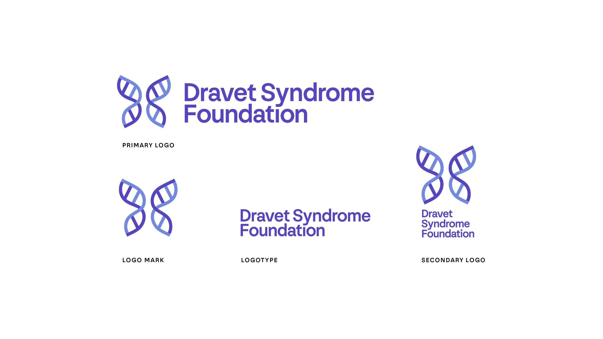
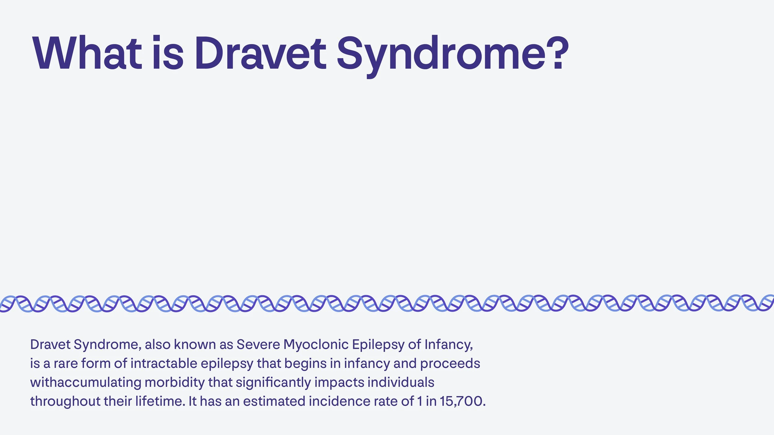
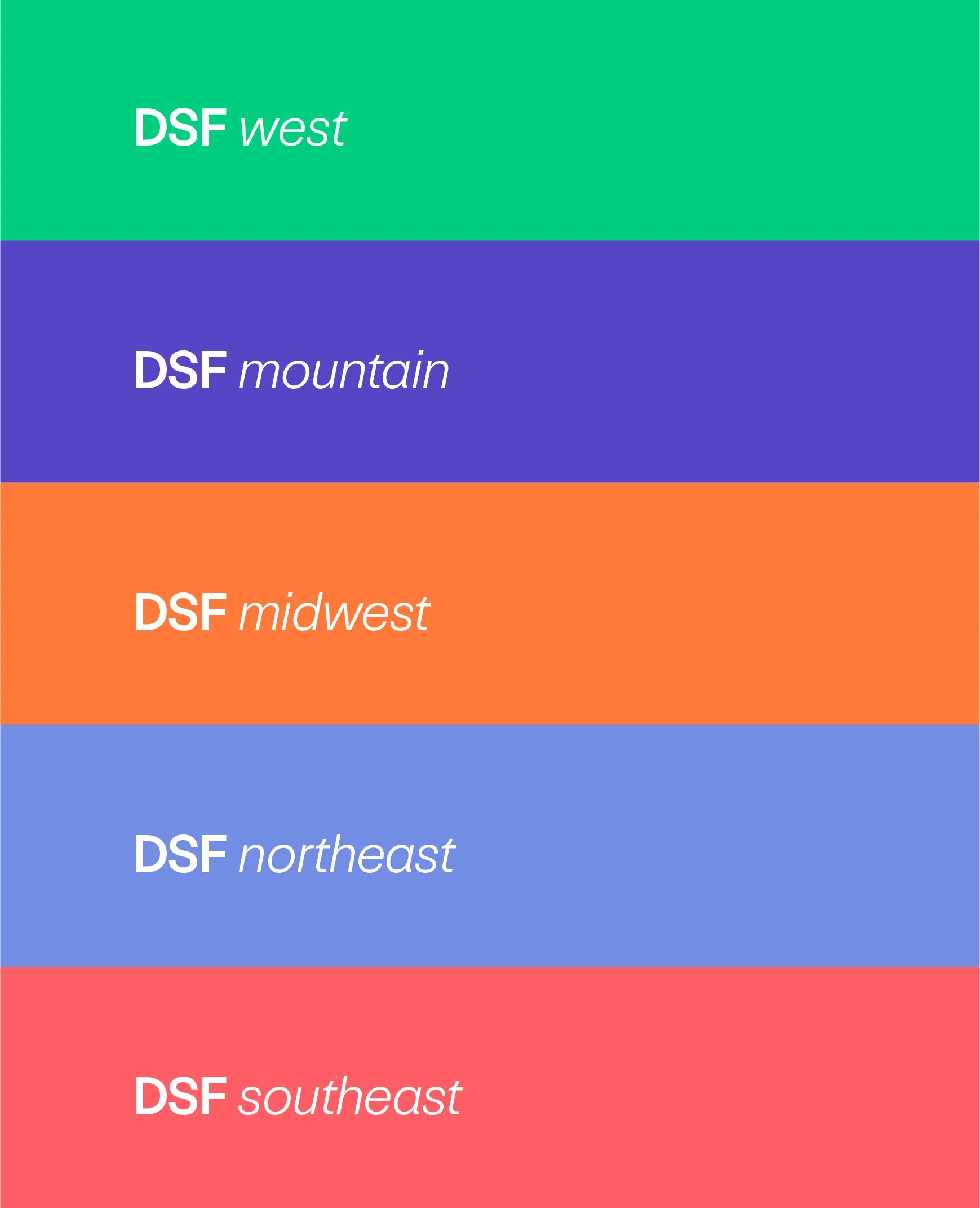
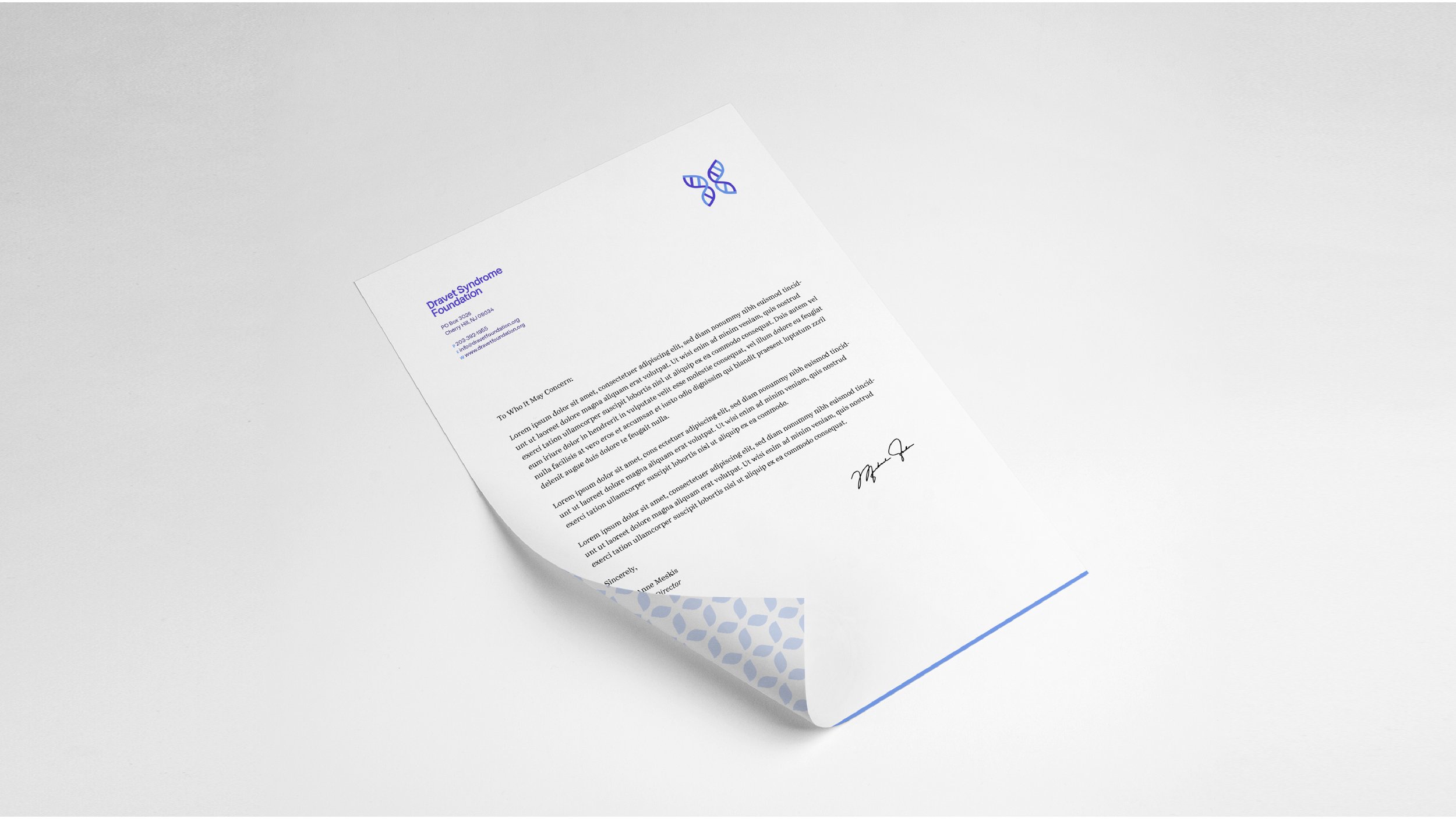
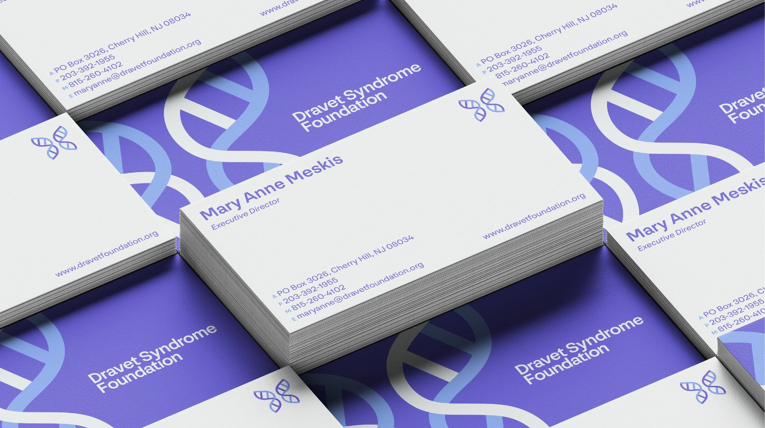
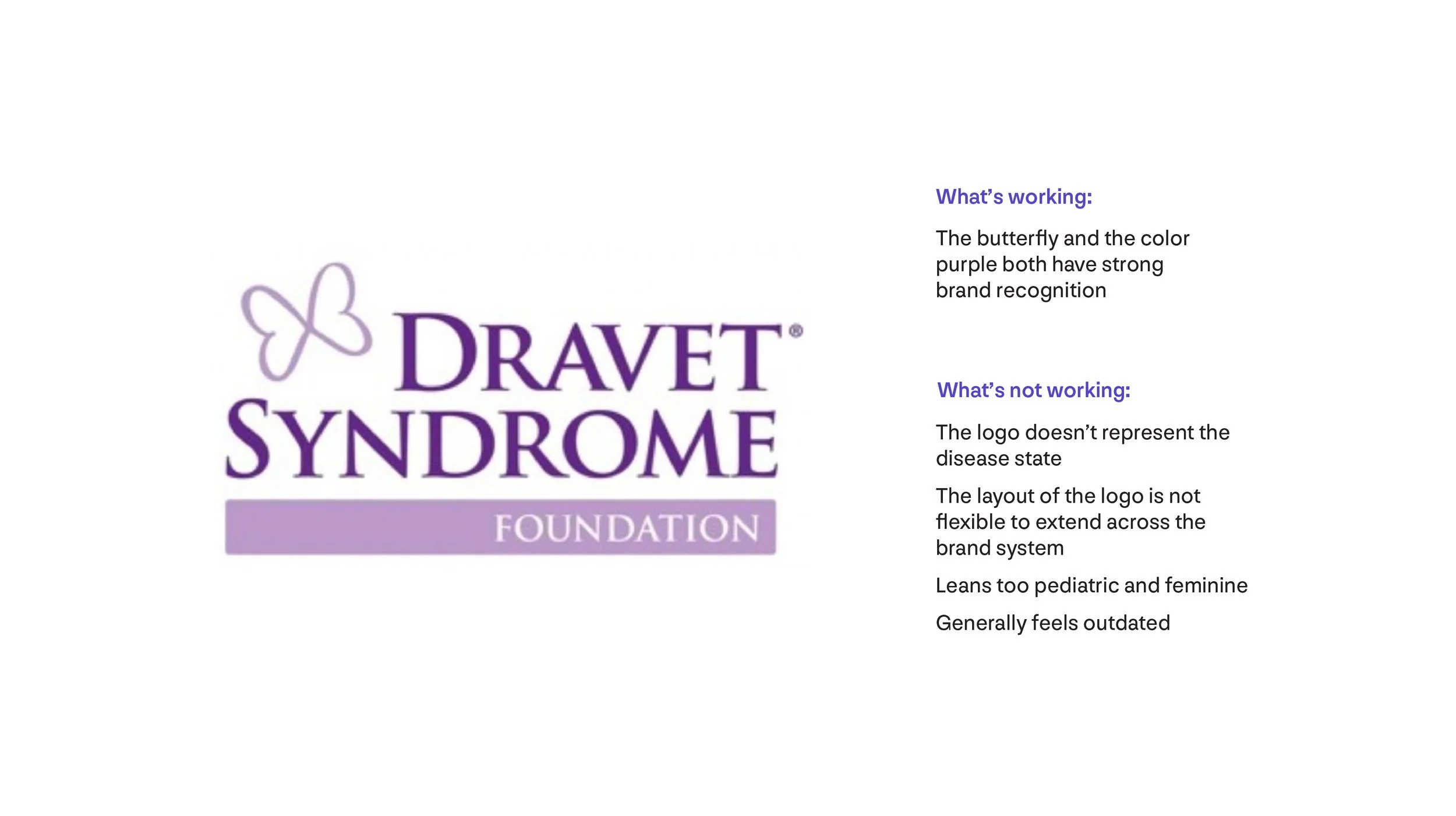
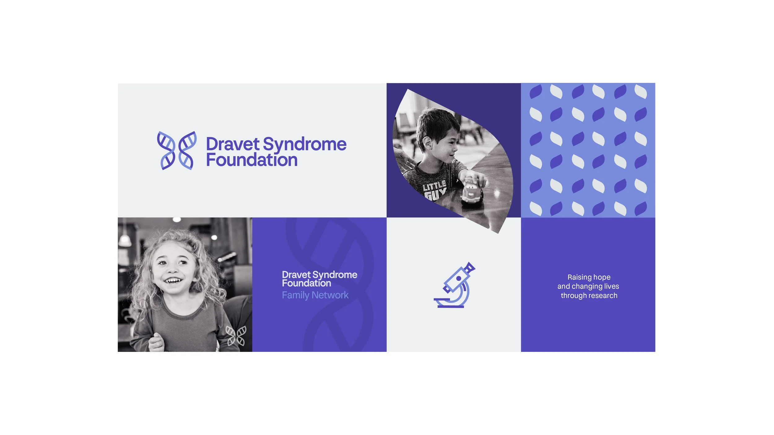
Before our work together, the Dravet Syndrome Foundation’s logo was outdated, not inclusive of their community, and not reflective of the genetic disease state. I created an identity that elevated the DSF’s look and feel to reflect their growth and established leadership in the field. At the heart of the identity are the iconic butterfly and color purple, loved and recognized elements in the epilepsy space.
ROLE
Branding
PROCESS
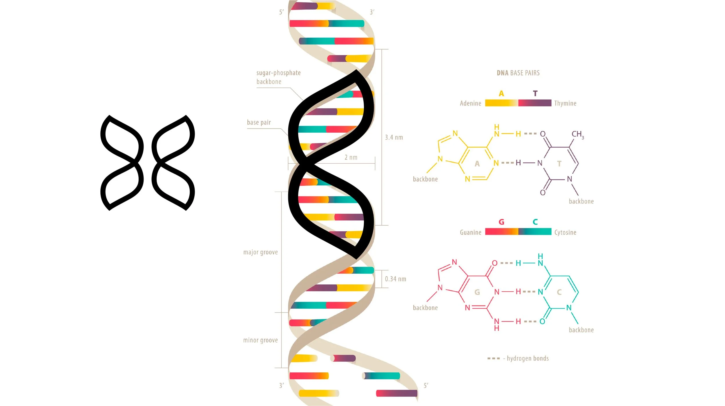
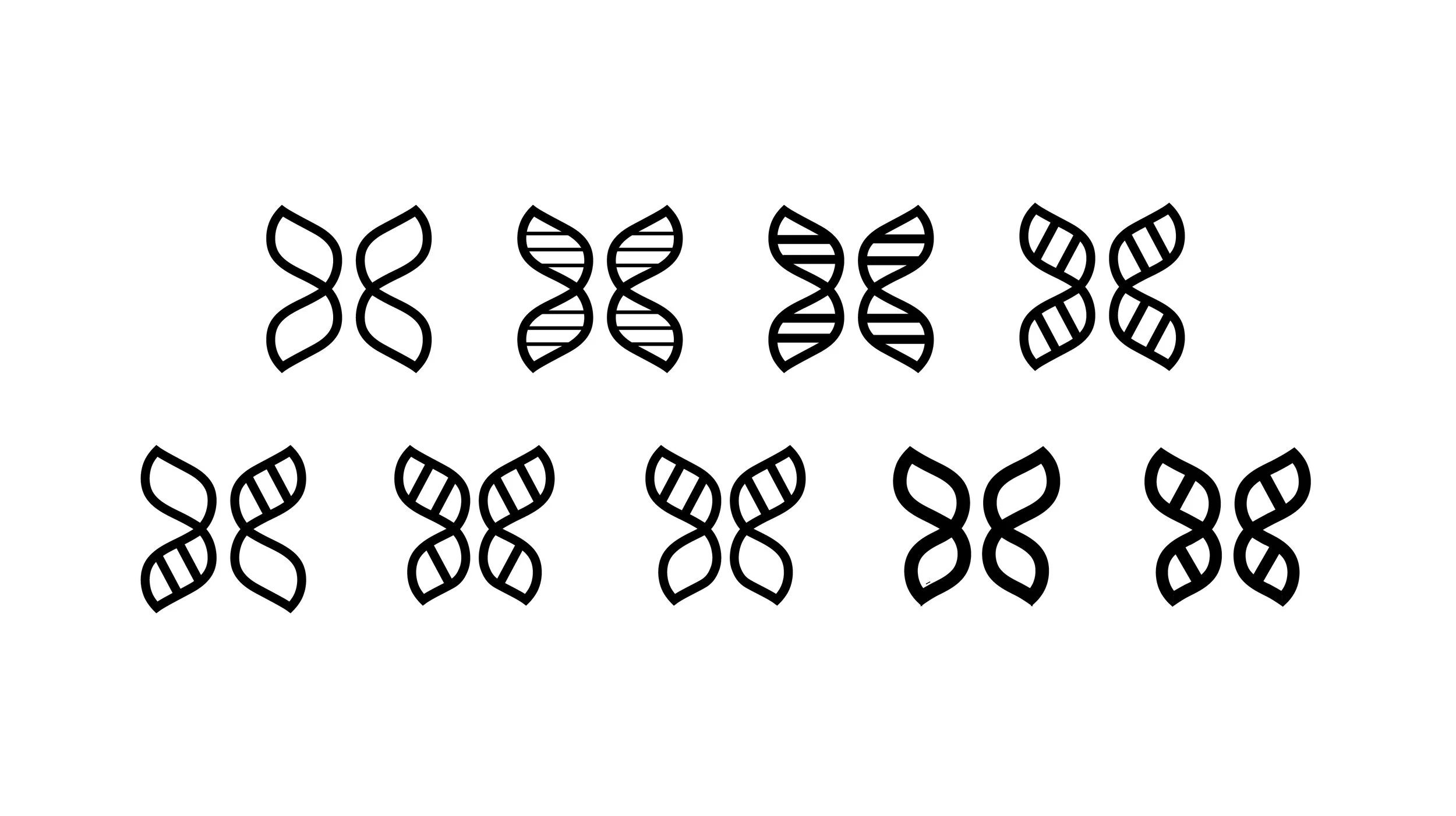
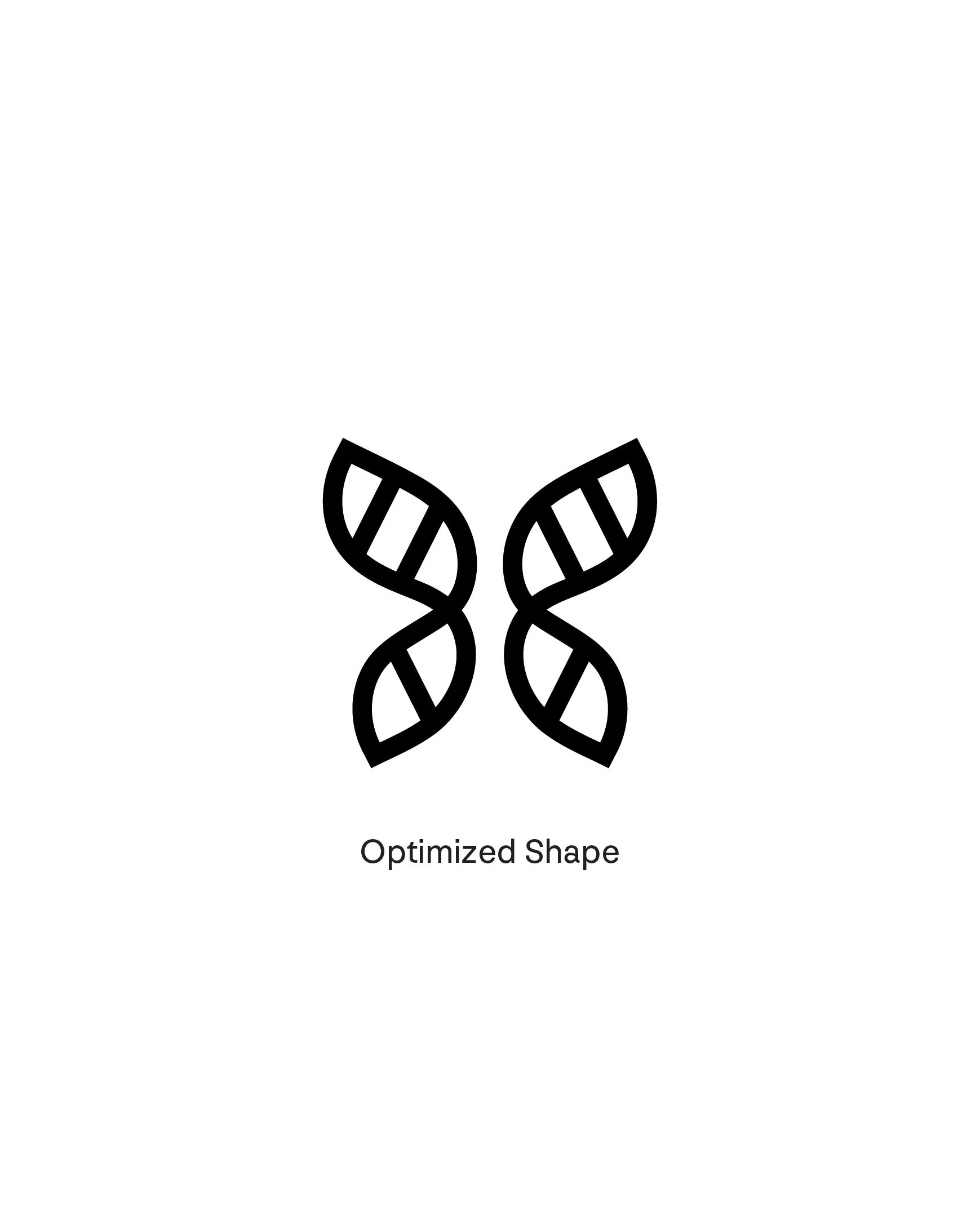
We started the project with a discovery session, in which included exploration around what is and isn’t working with the current logo and a competitive audit. To create a butterfly shape reflective of DNA, I traced the double-helix shape, explored nuances within the shape, and optimized the butterfly DNA logo mark.

